Automated Insulin Delivery (AID) System
In partnership with Verse and a leading diabetes technology company, I led project operations and supported the research and design of a next-generation Automated Insulin Delivery (AID) system, navigating the complex trade-offs between peak clinical outcomes and minimal user burden.
- Role
- Project Operations · UX Support
- Responsibilities
- Screener Development · Recruiting · Research Operations & Logistics · Synthesis & Insight Development · Design Iteration Support
- Team
- Project Lead · Lead Designer · UI Designer · Business Stakeholders (Algorithm, UX, Medical, Sales, Training)
- Tools
- Figma · Miro
Final concepts available upon request
Overview
The Problem
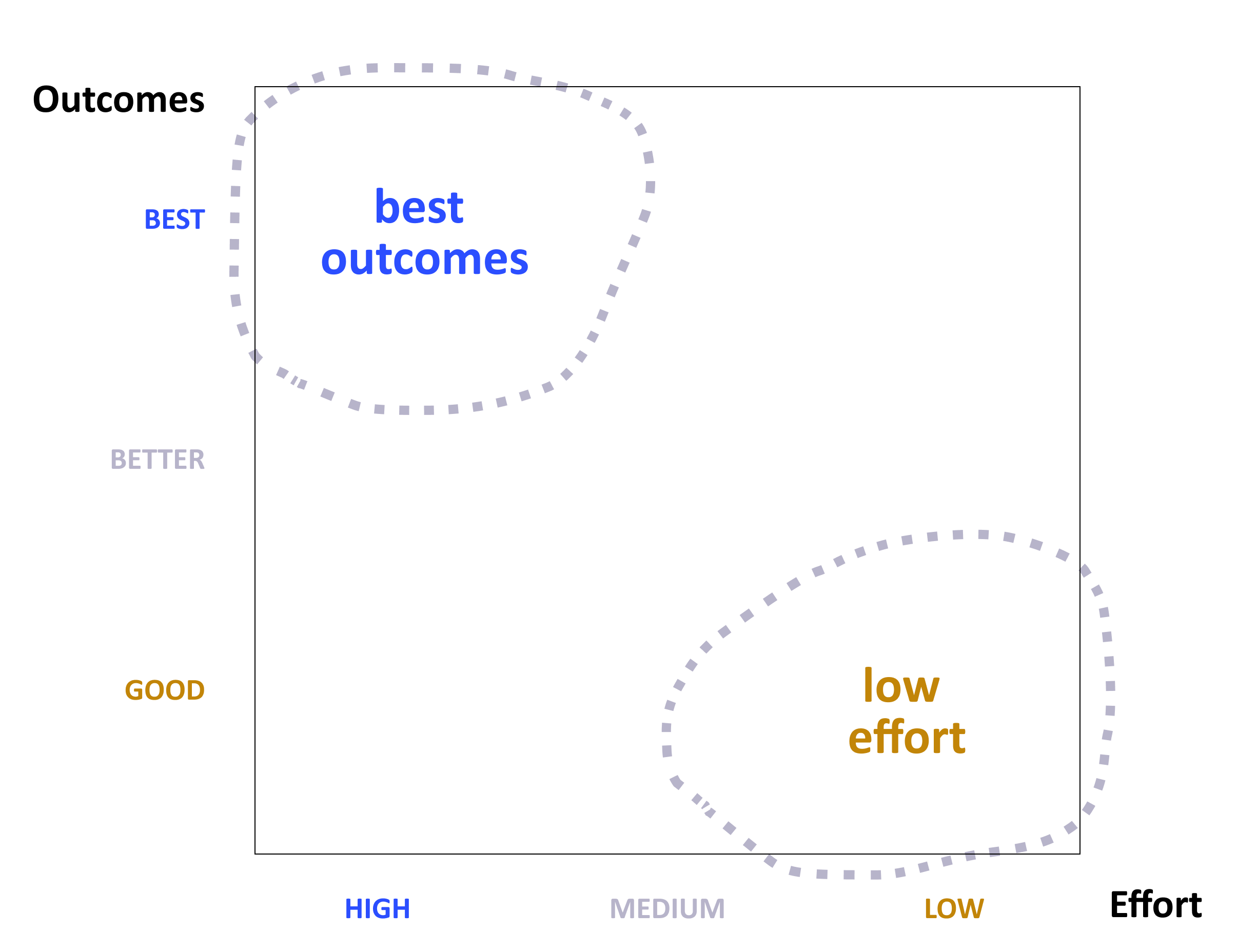
Today’s AID systems force a difficult trade-off. Device makers tend to optimize for clinical outcomes or ease of use—forcing patients to choose a device that fits their lifestyle at the expense of glucose outcomes, or vice versa.
The Goal
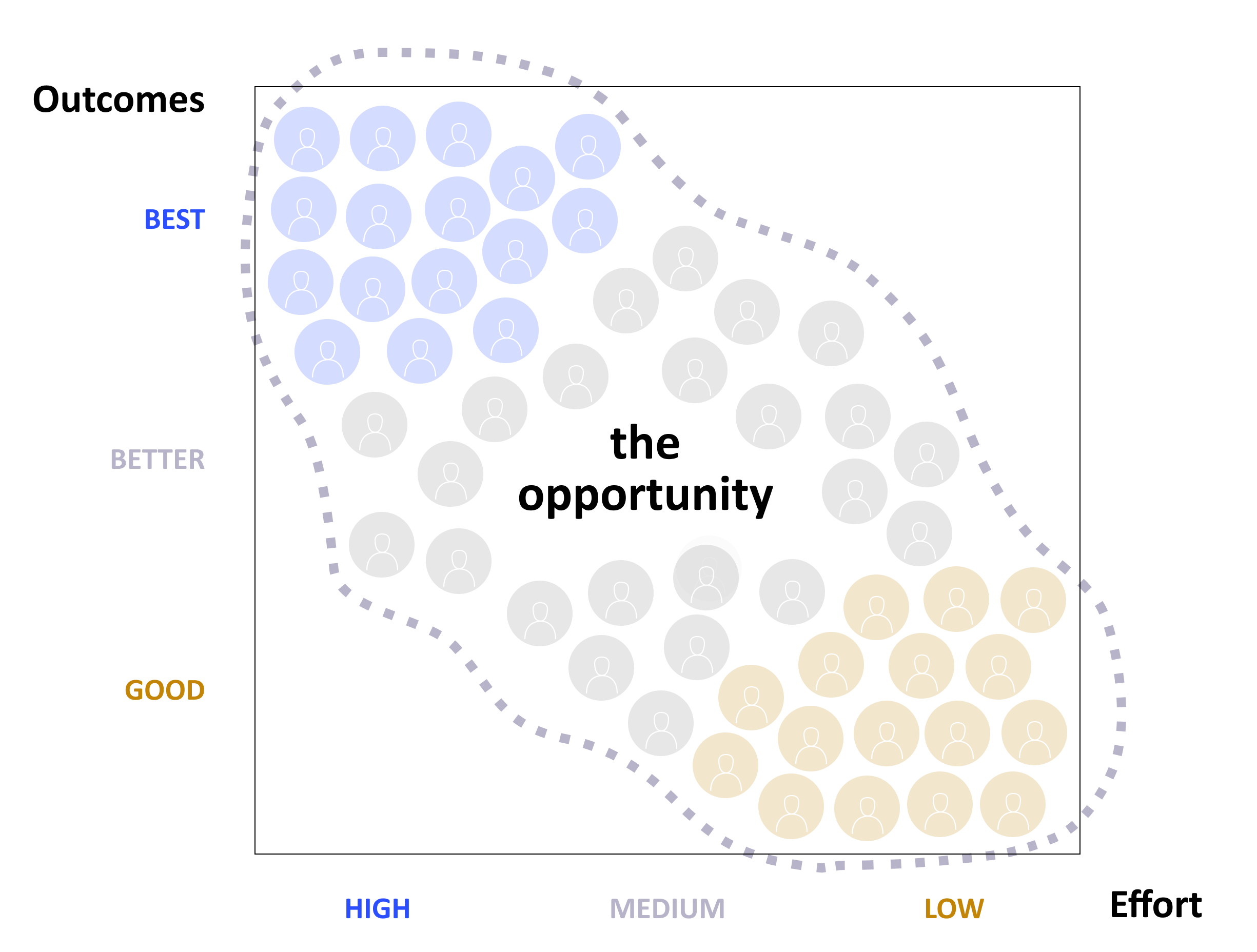
Explore the space between best outcomes and lowest effort to design a next-generation AID system that is both simple and powerful across four key areas of the user journey: Start Up, Monitoring & Trust, Insulin for Food, and Special Scenarios.
Our Users
We focused on two user groups, and also conducted interviews with two groups of endocrinologists—one focused on maximizing glycemic outcomes, another more selective about prescribing AID due to perceived adherence concerns.
Archetype A
Prioritizes Outcomes
“I want outcomes and control.”
Context
Experienced AID user · A1C below 7.5% · Highly engaged with glucose and insulin data · Self-describes requiring moderate to high effort to achieve glucose outcomes
Core Need
Visibility, precision, and agency without unnecessary friction.
Archetype B
Prioritizes Low Effort
“I have other things to think about.”
Context
On multiple daily injections (MDI) · A1C above 8% · Often skips mealtime insulin · Self-describes not using AID because it feels too complicated or MDI is working well enough
Core Need
Simplicity that still feels medically trustworthy.
Research Process
We conducted five rounds of iterative research, alternating between user archetypes before closing with clinicians. Each round used a mix of concept prompts, open-ended questions, and UX prototypes—building directly on what came before.
Findings by Opportunity Area
We researched four opportunity areas across five iterative rounds—building each concept on what we learned from the last.
Start Up
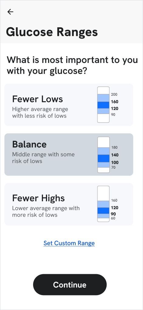
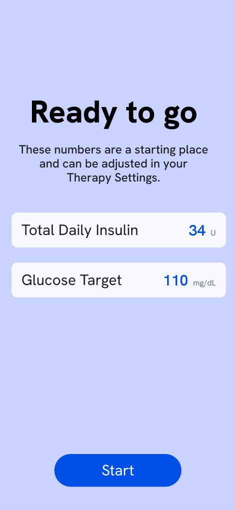
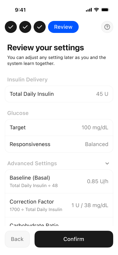
We presented users with a series of onboarding prototypes, asking them to walk through setup as if it were their own device. We focused on where expectations broke down and how much transparency was required to feel safe.
What We Heard
Glucose targets are deeply personal
No two participants shared the same goal—preset ranges felt dismissive rather than helpful.
Feeling personal mattered more than feeling fast
Users wanted setup to meet them where they were, not push them through a generic flow.
“Super simple” read as less trustworthy
Stripping things back too far backfired—users needed enough detail to feel the system was medically sound.
Transparency built confidence without adding burden
Showing calculations made users feel invested and safe, rather than overwhelmed.
“I’ve never sat down and done the math, but these numbers are good to see. It makes me feel more confident in the system.”
Tanya (TD, R4)
Prioritizes Best Outcomes
“80–140 is my real goal. That doesn’t match any of the presets.”

Francis (FL, R1)
Prioritizes Low Effort
Monitoring & Trust
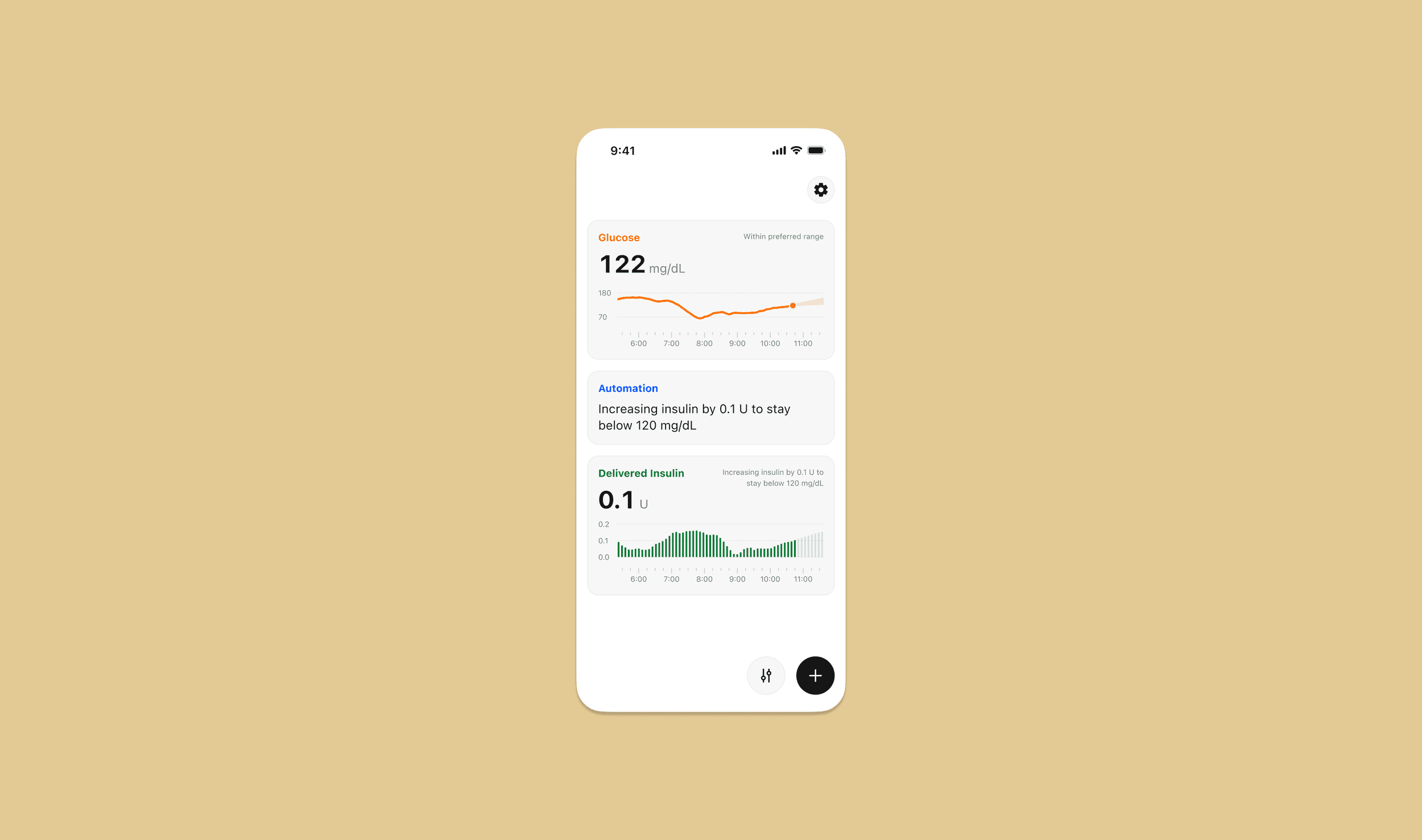
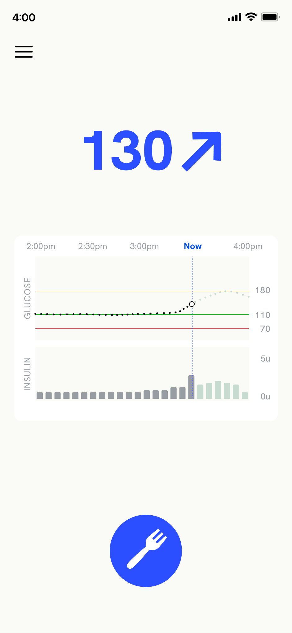
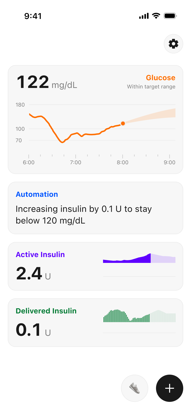
We tested various data visualizations to understand how each archetype interpreted automation in real-time. We wanted to see if data overwhelmed users or if it provided a sense of security.
What We Heard
Visibility Built Confidence
Contrary to initial assumptions, more data did not overwhelm users; for both archetypes, seeing the “work” increased system trust.
Reduced Unnecessary Intervention
For outcomes-focused users, access to granular data provided the reassurance needed to let the automation work without manual overrides.
Data as a Learning Tool
For ease-focused users, exposing the system’s reasoning acted as a passive educational layer, helping them learn AID logic in real-time.
Clinician-to-Patient Coaching
Clinicians viewed the transparency not just as a feature, but as a coaching tool to help patients understand their own glycemic patterns.
“I think it would help me understand how my body is reacting to the insulin.”

Aaron (AW, R3)
Prioritizes Low Effort
“I really like that it tells you what it’s doing. It helps you to learn how your pump is responding. I could say, ‘look at your phone… the pump is increasing its basal rate because you ate without bolusing.’”
Dr. Jessica (JB, R5)
Endocrinologist
Prioritizes Best Outcomes
“I’m constantly doing overrides so if I see that [glucose and insulin projection], maybe I don’t have to correct it.”
Christine (CP, R4)
Prioritizes Best Outcomes
Insulin for Food
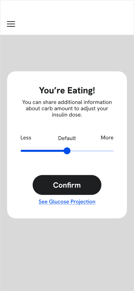
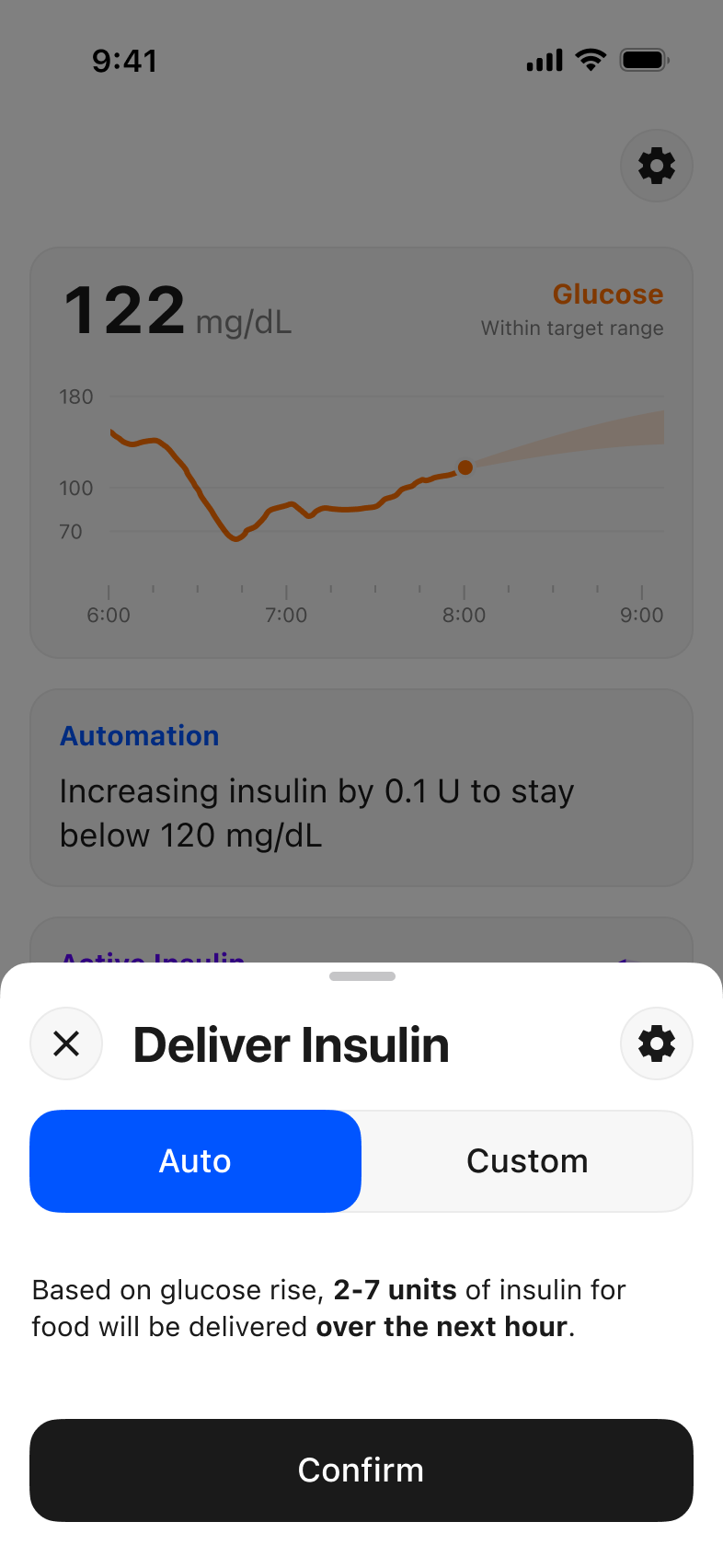
We first showed users a photo of a plate of pasta and asked how they’d handle it—surfacing real behaviors before introducing any system concepts. We then showed prototypes to understand how to best meet those mental models while reducing effort.

What We Heard
Mealtime tactics vary widely
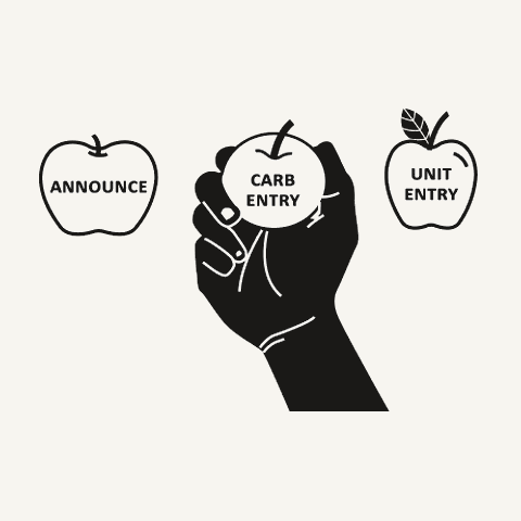
Carbs, units, or no bolus at all—people’s current tactics are very different, whether they choose to account by carb count, just dose in units, or skip entirely.
Behavior shifts by context
Chain restaurant vs. out on a date vs. eating at home vs. at a party—we heard that people dose insulin for food differently depending on where they are.
Automation without legibility doesn’t build trust
Participants expressed a strong need for visibility into automated system behavior; they weren’t willing to hand over full control without a clear “receipt” of the system’s logic.
“If I’m at Jason’s Deli, I can PDF the carbs all day long, but if I’m at Grandmama’s house, and she made me spaghetti… I would just eat and let the device figure it out.”

Jackson (JLM, R3)
Prioritizes Low Effort
“I wonder how much it gave me. I wonder, how much does it think I’m gonna eat? Does that make the system smarter? Or [will it just make me] have a high?”

Chris (CM, R2)
Prioritizes Best Outcomes
Special Scenarios
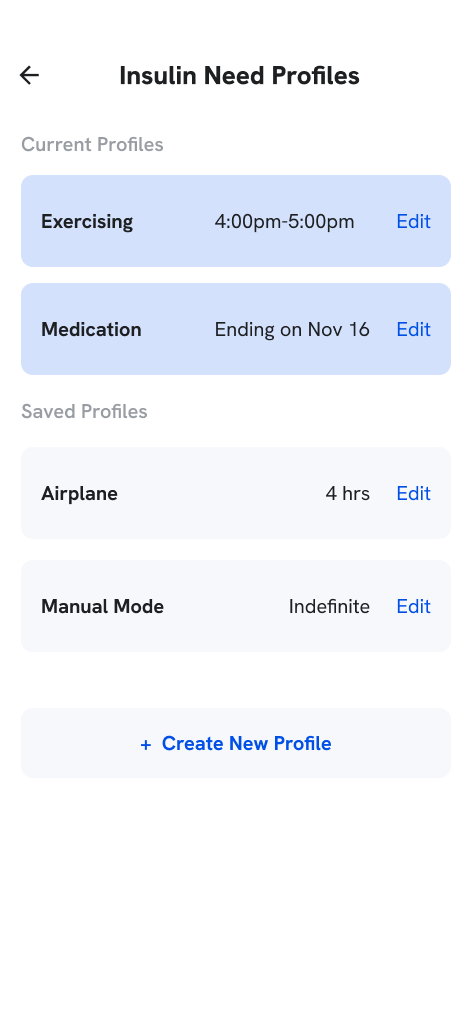
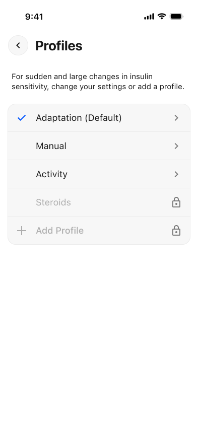
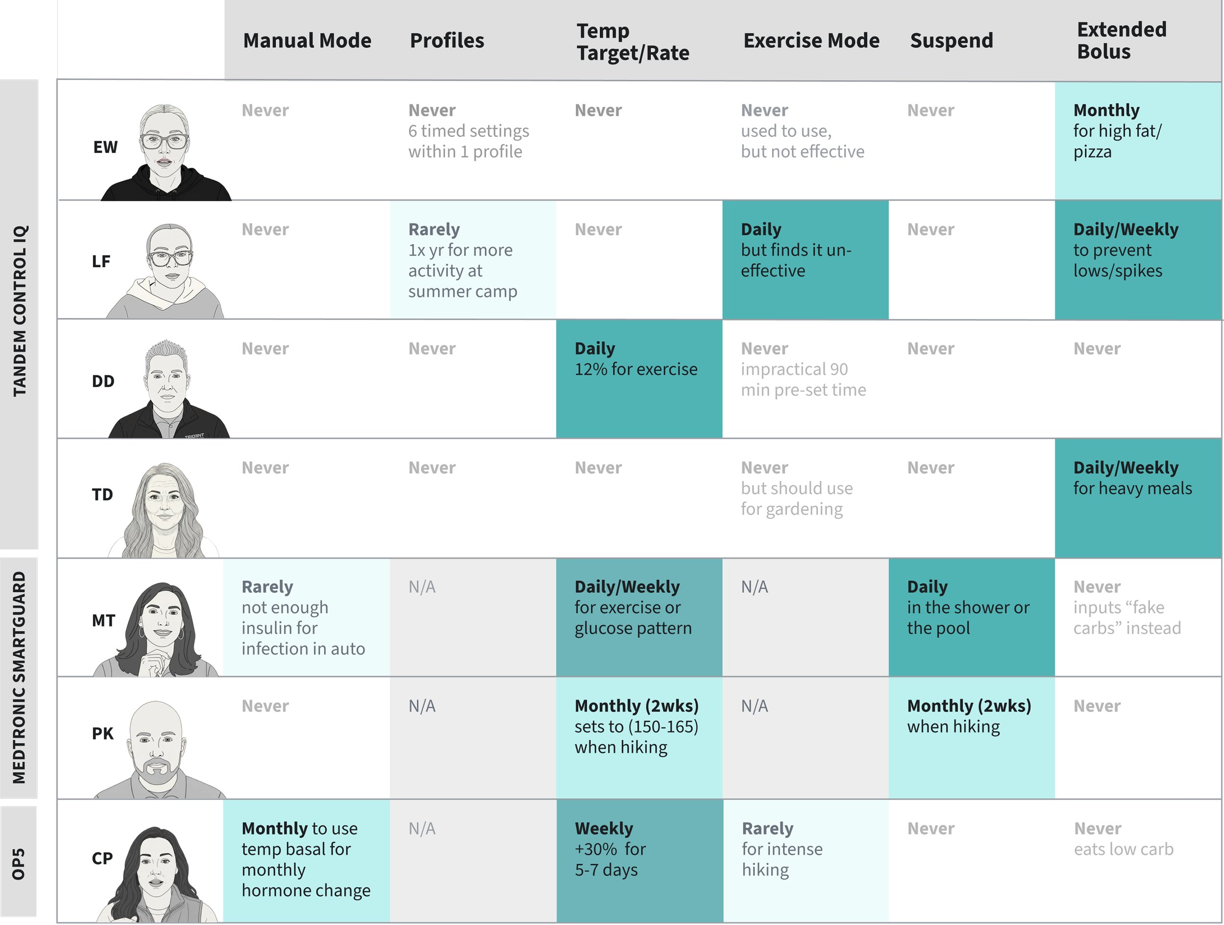
We asked users about their current settings usage—what they adjust daily vs. what they never touch. We then mapped these findings to design an interaction model that could meet these needs across daily and special scenarios, while also protecting them from high-stakes errors.

Intentional friction felt like safety
In high-stakes scenarios, users didn’t view extra steps as a barrier; instead, the added friction acted as a reassuring safety net against unintended clinical errors.
“I leave some of this editing stuff to the doctor… I’m just gonna let them explain it to me.”

Marissa (MT, R4)
Prioritizes Best Outcomes
“If I was constantly yo-yoing, even if I was staying in range, I would want to be able to make some changes and understand why that is happening.”

Lindsay (LF, R4)
Prioritizes Best Outcomes
“I think the locking idea and the training makes it feel safer… because you can’t just butt-dial it and change it.”

Dr. Jill (D, R5)
Endocrinologist
Selective
What We Heard
Three distinct adjustment categories
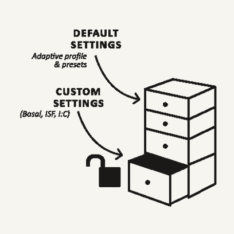
Settings fell into three models: Daily (temporary food/activity changes), Variable (periodic baseline tweaks), and Special (major resets for illness or pregnancy).
A sharp divide in user confidence
The gap between archetypes was significant: some adjusted settings confidently and often, while others—and their clinicians—avoided touching them entirely without professional involvement.
Intentional friction felt like safety
In high-stakes scenarios, users didn’t view extra steps as a barrier; instead, the added friction acted as a reassuring safety net against unintended clinical errors.
Key Takeaways
Across the five rounds of research, three universal patterns emerged:
- Goals, contexts, and histories are different—and evolve. Generalized, static experiences force people to fit structures that don’t match their lives.
- Less input does not mean less burden. Hiding complexity undermines trust and capability. Visible information—when framed well—builds confidence, not confusion.
- People expect more than closed-loop systems can currently deliver. Users want informed agency—not passive automation.
Design Principles
These three takeaways shaped three design principles that guided our final designs:
Principle
Personal
Reduce burden by letting people engage in ways that fit their existing mental models. Offer intelligent presets that can be personalized over time.

Principle
Transparent
Build trust through meaningful information. Explain recommendations in plain language and surface calculations so users understand the “why.”
Principle
Progressive
Stay simple by revealing complexity only when users ask for it. Smart defaults for low engagement; advanced options surfaced contextually.
Impact & Learnings
We presented our final concepts to stakeholders across algorithm, UX, medical, sales, and research teams. The work informed ongoing exploration of future AID system experiences.
My path into UX began with an interest in medical devices—especially insulin pumps—so working on this project was particularly meaningful. While my experience with Type 1 Diabetes helped me empathize with our users, it also revealed just how diverse user needs and behaviors are. Several insights challenged my own expectations, reinforcing the importance of grounding decisions in user research and designing for true user intent.
Due to confidentiality agreements, certain details have been generalized or redacted. This case study focuses on process, contributions, and key patterns observed.